
“If You Think the World is a Balloon in Your Head:”
Rethinking Vignettes
Andrei Pop
“The peculiarity of vignette is that it sets the subject emphatically apart from the world, like a richly decorated frame, while at the same time allowing it to emerge gradually, organically, like an inmate of the world itself.”
Volume One, Issue Two, “Air Bubbles,” Essay
Thomas Baldwin, “A Circular View from the Balloon at its greatest Elevation,” in Airopaidia: containing the narrative of a balloon excursion from Chester, the eighth of September, 1786, taken from minutes made during the voyage, 1786, Courtesy of Smithsonian Libraries, Source.
What if the world were a balloon in your head? Looking at Thomas Baldwin’s vignette from 1786, we might be tricked into believing so. Set above the clouds at the balloon’s greatest elevation, the image suspends us in the air — almost as if we are looking down at the earth below. The image is neither an accurate depiction of the clouds nor the perspectival aspects of ascension, but, rather, the spherical formation is not unlike the shape of an eye with an iris containing the visible ground at the center. The magic of the picture is that it allows us to experience a hot air balloon adventure simply by looking at an illusionistic image in a book. In his article “If You Think the World is a Balloon in Your Head:” Rethinking Vignettes, Andrei Pop closely examines a series of primarily nineteenth-century vignettes that play with and resemble our own visual fields. Pop draws out the enclosed yet open quality of the vignette as well as its capability to blur distinctions between worlds, setting one simultaneously within and without, much like how the bubble creates a fluid boundary between the inner and outer. As Baldwin’s image raises us high above the ground, the vignette leads us to reflect on our own experiences of seeing and imagining. Pop’s subtle and astute observations allow us to enter, exit, and create these bubble-like worlds, as well as ponder a myriad of interdisciplinary examples and our own subjective visions and daydreams.
- The Editors
The kind of picture I have in mind is described by Edgar Allan Poe in “The Oval Portrait.” Its injured narrator finds shelter in an isolated chateau and passes the evening perusing the resident picture gallery and its catalogue. One picture, of “a young girl just ripening into womanhood,” so takes him aback that he has to close his eyes before looking at it again just to get his bearings.
The portrait, I have already said, was that of a young girl. It was a mere head and shoulders, done in what is technically termed a vignette manner; much in the style of the favorite heads of Sully. The arms, the bosom and even the ends of the radiant hair, melted imperceptibly into the vague yet deep shadow which formed the back-ground of the whole.1
The narrator realizes he was dismayed by the work’s life-likeliness, and, in the catalogue, reads of its cause: a painter husband painting his wife, the color draining from her cheek even as it enters the painting, so that at the final touch, she expires.
What Poe accomplishes in a very brief compass is a creepy and suggestive parable of the porous boundary between art and life. But I am more interested here in the narrator’s art criticism:
As a thing of art nothing could be more admirable than the painting itself. But it could have been neither the execution of the work, nor the immortal beauty of the countenance, which had so suddenly and so vehemently moved me. Least of all, could it have been that my fancy, shaken from its half slumber, had mistaken the head for that of a living person. I saw at once that the peculiarities of the design, of the vignetting, and of the frame, must have instantly dispelled such idea — must have prevented even its momentary entertainment.2
How odd that Poe draws attention to the vignette technique, which he himself labels technical jargon, twice in the same paragraph, only to discount its contribution to the work’s pull. Writers have their wiles, and this may be a technique of his own for emphasizing the singular origin story rather than the fashionable manner he associates with portraitist Thomas Sully.3 Still, one might feel the narrator’s first reaction, which Poe in the first version of the tale compared with “the shock of a galvanic battery,” has to do with the way the figure “melted imperceptibly into the vague yet deep shadow” of the background, especially since the painting is glimpsed by candlelight. Romantic themes of art and life, life and death, and art and death, and of the permeability of waking life, dream, picture and story, run rife in “The Oval Portrait.” A deconstructionist critic might insist that it is precisely the incompleteness of the vignette, its fragmentation of the complete figure, which makes it lifelike. But it would be a misstep to rule too categorically on something the vignette always does — even outside the confining question of lifelikeness. Its aesthetic valence may have been more on Poe’s mind, given his elaborate description of the frame: “oval, richly [, yet fantastically,] gilded and filagreed [sic] in Moresque.”4
One peculiarity of the vignette is how it sets the subject emphatically apart from the world, like the richly decorated frame, while at the same time allowing it to emerge gradually, organically, like an inmate of the world itself. The text tends in this direction, since from the circumstances of the painting’s discovery we are plunged into the catalogue text recounting its making and the sitter’s demise: the painter, “crying with a loud voice, ‘This is indeed Life itself!’ turned suddenly to regard his beloved: – She was dead!”5 The story ends on closing quotes (read from the catalogue), as if itself vignetted off at the end. Poe made a symmetrical cut in his 1845 revision, striking the long opening of the text, which told of the narrator’s hardship — wounded by banditti, forced to break into an unoccupied mansion in the Apennines — and of his hesitating over the size of a dose of opium he intended to swallow to allay his pain.6
Whether the cut was made to focus better on the portrait or for formal reasons, the resulting in media res opening — “The chateau in which my valet had ventured to make forcible entrance…” — seems as peremptory a vignette effect as the sudden ending.7 It is as if, to compound the dreamy, florid frame on the fictive painting, Poe appended a real and equally artful, if simpler and deadlier, edge around the story.
In departing from Poe, it is worth specifying what this essay is not about. The invention and mutation of the vignette, an image with indeterminate, often rounded edges that fade gradually, named after the “little vine,” from a printer’s decorative motif featuring classicizing grapes and vines to the familiar circular or elliptical open form (still vaguely recalling a bunch of grapes?) in the seventeenth and eighteenth century, its flourishing in the Victorian era of wood engraving, its decline in the rectangular age of photographic illustration, and its popular survivals and revivals, from portrait photography to the soft-focus close-up and the user interfaces in today’s first-person games, could fill several volumes of book and media history — to leave aside narratology, for a vignette is also an anecdote or brief tale pursued by Poe and peers like Washington Irving and E.T.A. Hoffmann.8 I leave that to less vignette-like writings. Nor do I argue for a programmatic relation between the vignette and the romantic fragment, or revolutionary ambitions like the breaking of all bounds between the arts, or between art and life, as do Henri Zerner and Charles Rosen in their path-breaking essay on “The Romantic Vignette and Thomas Bewick.”9 Their concern was the avant-garde’s romantic inheritance, which is extensive. The phenomenon that interests me rather is Poe’s modern theme of being drawn to the atmosphere of the artwork, made puzzling by the vignette’s apparent lack of differentiation from its environment. It will emerge that this particular self-enclosed ‘but open’ quality of the vignette makes it attractive not just for casual, light-hearted narrative — one that does not take its own verisimilitude too seriously — but also for representing subjective states like seeing and imagining, whose vividness and apparent self-sufficient enclosure coexists with failure to perceive sharp boundaries around the experience, much less what lies beyond. Indeed, the punctual but unbounded character of most conscious experience makes the vignette a humble but effective graphic means for evoking it, so that the image within may read as a daydream, a surmise, a visual glimpse, but in any case a bubble of the viewer’s own blowing.
Openings
The subjective use of vignettes has romantic roots. I prefer to approach it quietly, as it were, not in visionary works by the likes of Grandville or Delacroix, but from the muted, Biedermeier side of the romantic mainstream, in the illustration of a tale by Hans Christian Andersen. “The Princess and the Pea” (or “The Princess on the Pea,” its title in Danish) is one of Andersen’s shortest at about three hundred and fifty words. Published in 1835, it and the other Eventyr [Adventures] got the wood-engraved vignette treatment in 1851, at the hands of one Vilhelm Pedersen. They are found at the head and foot of every story, like clockwork, the first larger and more elaborate to draw the reader in, the second like a casual wave of the hand to see a friend off.

“Here is the headpiece advertising “The Princess and the Pea,” summing up the plot while posing a riddle for the uninitiated: by candlelight, a crowned personage and her attendant climb an armchair with the intent of stacking a monumental bed, its floppiness emphasized by the wooden angel, looking more like a satyr, who decorates the bedstead and has been fairly turned into a caryatid, a mattress on his head.”
Figure 1. Vilhelm Pedersen, Headpiece to “Prindsessen paa Ærten” [The Princess and the Pea], Hans Christian Andersen, Eventyr. Med 125 Illustrationer efter Originaltegninger af V. Pedersen (Copenhagen: C.A. Reitzel, 1850), p.299.
Here is the headpiece advertising “The Princess and the Pea” (Figure 1), summing up the plot while posing a riddle for the uninitiated: by candlelight, a crowned personage and her attendant climb an armchair with the intent of stacking a monumental bed, its floppiness emphasized by the wooden angel, looking more like a satyr, who decorates the bedstead and has been fairly turned into a caryatid, a mattress on his head. The backstory is this: a prince interviews aspiring princesses; disappointed with the applicant pool, he allows the queen mother to try her hand. She puts one (dried) pea beneath twenty mattresses and twenty eiderdown duvets. Then princesses are invited to spend the night on them. Despite all the padding, a ragged-looking candidate wakes up black and blue (black and brown in Danish), and complains that she slept on rocks. She duly gets the job, and the pea is put in a museum. The key sentence explains why: “Only a real princess could be so sensitive.”10 In the endpiece, Pedersen pictures this daintiness in the final resting place of the pea, a leafy setting dominated by the crown and other jewels, among which the pea is impossible to pick out; instead, there are round jewels all around and strings of pearls like peas in a pod, or eyes staring back at us (Figure 2). But the narrator told us with a wink that the pea is still there in the Kunstkammeret, “if no one has taken it”! Who would do such a thing and leave the crown jewels? And if the jewels (and pea?) are in their case as they should be, why so much vegetation? Or were the jewels thrown out to make room for the pea?

“But ending the story with a vignette has a contrary effect to the usual tying of loose ends: showing us a sliver of the fictional world we have just left, we wonder if that parting glimpse was in fact reliable.”
Figure 2. Vilhelm Pedersen, Tailpiece to “Prindsessen paa Ærten” [The Princess and the Pea], Hans Christian Andersen, Eventyr. Med 125 Illustrationer efter Originaltegninger af V. Pedersen (Copenhagen: C.A. Reitzel, 1850), p. 301.
Such comic agony of uncertainty is probably not a common response to the tale.11 But ending the story with a vignette has a contrary effect to the usual tying of loose ends: showing us a sliver of the fictional world we have just left, we wonder if that parting glimpse was in fact reliable. Pedersen throughout the book uses a simple convention: a dark, deeply shaded, vignette for headpiece, giving the space of the tale some depth, and a light, calligraphic endpiece without much inked negative space.12 The closing vignette is so tightly designed that it prunes the riotous vegetation (taking care to leave intact, in the lower right corner, the artist’s name), obscures whether we are outdoors or looking into a display case, and even shaves off the tips of the middle and index finger on the scepter to the left of the crown. Readers who have detected in the story a populist dig at neurotic royals will be pleased at this demotion of the symbols of power. But that is a moral more appropriate to “The Emperor’s New Clothes.” And it imputes a tendentiousness the last vignette just doesn’t have: its lighthearted poke is not at the characters, but at the reader.
The story too is less about the foibles of the rich and frivolous than about the power of discernment — the hero is after all the wily old queen who devises a princess test of the right, vanishingly fine, resolution. We see her at work setting her trap in the beginning, with the image serving as a trap for us; in the end we are left staring at a scrap of that world, searching the little salad idly for a pea we may be too dull to find. Or perhaps I alone am dull and you have found it already, disguised as a pearl!13
Regardless of our own sensitivity, the coup of this very clever image is how it manages visually what the narrator does conversationally: turning from an object in the story to the reader, who may or may not be credulous enough to try to find it in some museum. It is deliciously pat that the last sentence, and paragraph, of the text is only an exclamation: “See, that was a proper story!”14
If the first frontispiece reveals the fable, the second reveals the reader. It could not do this, however, if the tightly-focused little ball of greenery and valuables was not capable of drawing us in more intensely than the image of the queen at her work, less as an epilogue to the story than a glimpse through a keyhole so that we doubt our eyes.
Shadow of a Doubt
Pedersen’s vignettes work as a gateway to (and away from) Andersen’s fable. He may be aiding the storyteller in getting the audience to suspend disbelief. Diametrically opposed stands that self-image of the avant-garde as a challenger of reverie, often through an emphasis on the how rather than the what of representation. There is no reason why the vignette, with its provocative petering out at the edge of its intrapictorial frame, and its witty play with narrative and decoration, might not participate in modernist practices of questioning the means of artmaking any more than modernists must assert the finitude of the pictorial field.15 True, the vignette’s use in realist novels and children’s literature — think David Copperfield or Winnie the Pooh — may have lulled modernists. But it was as beloved by those alleged paragons of avant-garde austerity, Édouard Manet and Stéphane Mallarmé, in their collaborations, which have not attracted much modernist attention either, being as it were narrative and illustrative.16 They do not, as we will see, renounce the kind of compulsive subjectivity we found in Poe and Andersen, but intensify it to a kind of breaking point of intelligibility.
Manet drew his greatest vignettes for Mallarmé’s translation of “The Raven” by Poe (1875) and the poet’s own “Afternoon of a Faun” (1876). I have treated Manet’s transfer lithographs for the deluxe book edition of Le Corbeau at some length, so I will not rehearse here that interpretation’s focus on the ineffable in Poe at the expense of the grotesque, in contrast to the poem’s other great illustrator, Gustave Doré.17 Instead, I will begin by pointing out that Poe’s own theory, in his “Philosophy of Composition,” of the artistic superiority of the brief lyric poem and prose story might be extended to the visual vignette, which we have seen him praise in “The Oval Portrait.”18 Likewise, if, as Zerner and Rosen point out, lithography freed the vignette from the technical rigors of the wood engraver’s burin to make it a painter’s tool (e.g., in Delacroix’s Faust), then Manet’s full-page illustrations, with their cursive line coalescing into contemporary costume, facial hair and furnishings, rather than Poe’s 1840s milieu (Doré is again a salient contrast), argue for the autonomy of the illustrator — provided, of course, that like the translator, he had read thoughtfully.
The first lithograph tracks the incantatory opening, “Once upon a midnight dreary / As I pondered, weak and weary.” Despite its wintry gloom and virtuoso lamplight, it is a ‘dark-style’ vignette akin to the Pedersen headpiece to the “Pea” (Figure 3).19 Once past the fuzzy zigzag edge of the black oval, the viewer swims through the inky murk toward a room where “I pondered, weak and weary.”
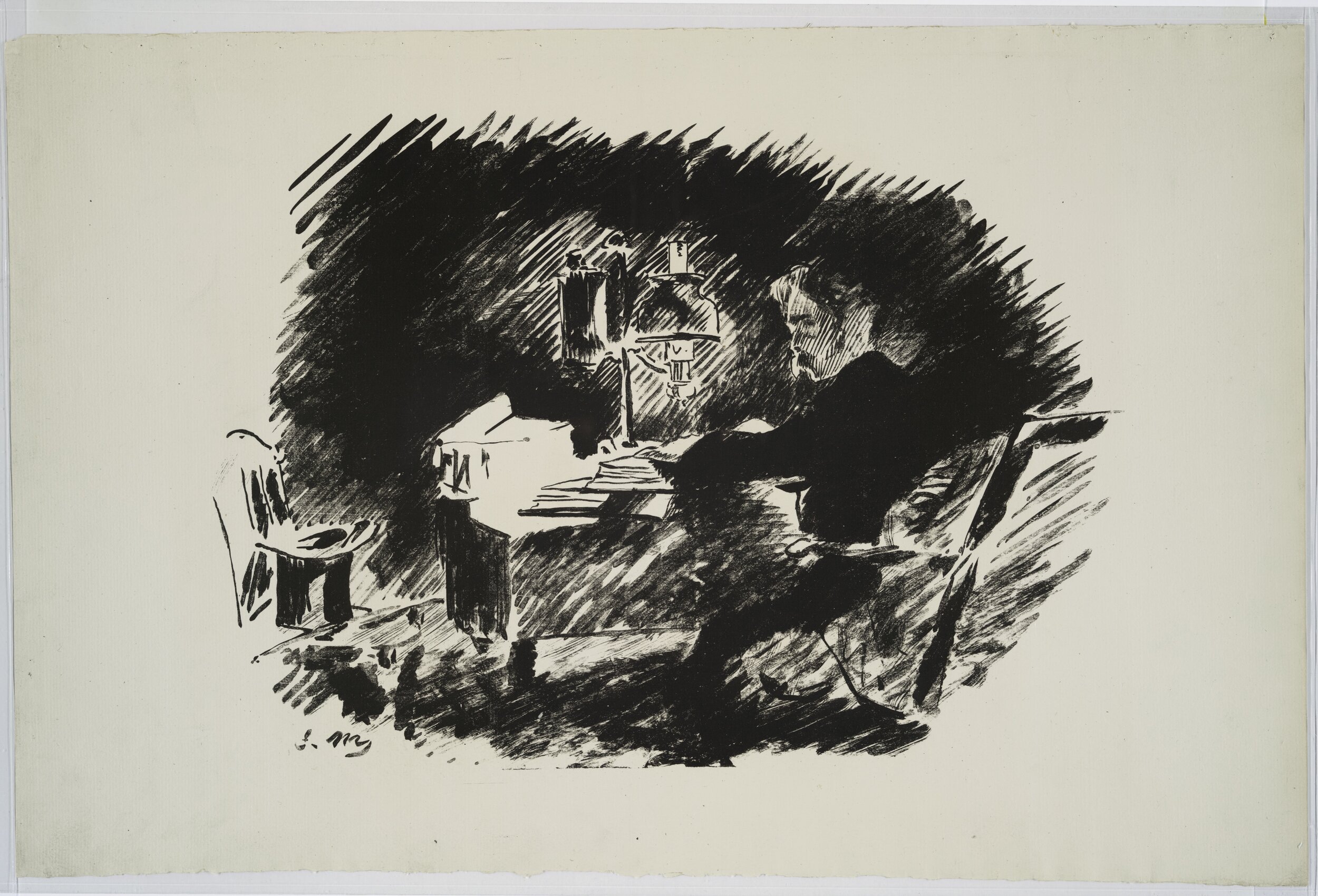
“As palpable as this feeling of intrusion is the effect of lamplight, a recurrent motif in the poem. Here, diagonal strokes electrify the air around the lamp, making for inkless, negative-space flashes of light around the lamp and on the desk’s surface.”
Figure 3. Édouard Manet, ‘Le Bureau’ [The Desk], first lithographic illustration to Stéphane Mallarmé’s translation of “The Raven,” Le Corbeau (Paris: Lesclide, 1875).
We peer at the speaker sunk in his volumes of “forgotten lore,” standing behind his left shoulder, not far from Manet’s signature and the chair bearing what may be his hat and cane.20 As palpable as this feeling of intrusion is the effect of lamplight, a recurrent motif in the poem. Here, diagonal strokes electrify the air around the lamp, making for inkless, negative-space flashes of light around the lamp and on the desk’s surface. These cursive strokes build a stylistic continuity with the dramatic second and third illustrations (of the window thrown open to admit the raven, and the narrator seated before its perch on the bust of Pallas). It is as if the opening vignette, with its relative distance to the action and its static presentation of the hero (it is telling that the 1991 editors of Mallarmé’s autobiographical letter to Verlaine reprint the lithograph as if a frontispiece portrait of the poet), printed in landscape format so that we have to turn the book to see it properly, presages the visionary irruption of the raven into this closed world.
I hurry to the last, deceptively quiet vignette, which completes the cycle of immersion, intrusion, and renewed sinking into solitude as decisively as Pedersen’s play with the pea (Figure 4). It too is a ‘light’ vignette; the agitated diagonals of the lamplight reappear in the winding column of the raven’s shadow on the floor, and in the shadow of the chair — vignettes within a vignette, the chair (and its shadow) cut off peremptorily by the edge of the plate, like the fingertips on Pedersen’s scepter. There is more — a laughably sketchy doorframe and a double avian shadow hovering just over the edge of the seat, smaller and conspicuously missing the beak which dominates the bottom of the print in the inverted shadow of the raven, projected from where it sits on the bust of Pallas, out of view. Manet’s signature, still at bottom left, is conspicuous against the blank page, where no human presence is any longer visible.

“The hero, then, is not so much absent as dematerialized, a melancholy viewer: a role the artist ironically proffers to us in his place, and which has made this image, within the modest compass of book illustration, as bracing as any performance by Manet.”
Figure 4. Édouard Manet, ‘L’Ombre’ [The Shadow], final lithographic illustration to Stéphane Mallarmé’s translation of “The Raven,” Le Corbeau (Paris: Richard Lesclide, 1875).
The mustachioed protagonist of the first three prints is gone, even as the poem ends on the assurance that “my soul from out that shadow that lies floating on the floor / Shall be lifted — nevermore!”21 The hero, then, is not so much absent as dematerialized, a melancholy viewer: a role the artist ironically proffers to us in his place, and which has made this image, within the modest compass of book illustration, as bracing as any performance by Manet.22 With Le Corbeau, we have reached a stage in the imaginative use of the vignette that, if we do not want to identify it with a state of catatonic melancholy (Poe’s own view of the narrator’s mind at the end of “The Raven”), we ought to interpret more capaciously as a depiction of the field of vision: the subjective visual experience of the dejected narrator. As with Pedersen’s pea, this is less the effect of naturalistic mimesis — offering some question-begging argument that “this is what the world, or more precisely, seeing the world, looks like” — than of tactfully deployed conventions like narrow focus and indeterminate boundary. If the reader takes a moment to examine their own visual field, mono- or binocular, with its blurry probable impingements of nose, cheek, and hair, they will see that it hardly resembles a printed ink figure set framelessly on a page. But then it doesn’t exactly resemble any other finite object of vision either. In the same way, we do not see a dead zone (not even the protean “field” experienced on closing the eyes) outside the bounds of vision. Spectacles aside (which impose their own blurry frame on the visual field of wearers like myself), we don’t even see the shape of our visual field — nor is there any reason to think it rigid, for the moving eye can extend it by muscular effort. On the other hand, if we take the visual field metaphor literally, as Ernst Mach did in his famous 1886 vignette of his act of seeing (Figure 5), we need not regard the blank paper as the content of a larger framed picture (the totality of the page), engaged in a figure-ground relation. The blank page, which in a printed book is not automatically a blank image in the modernist manner, becomes around the vignette an indifferent fictional environment, filled with type or blank paper, the indeterminate world out of which the image, understood as a mental representation of the physical world, emerges.23 That is because the world we see, or imagine, is not visible as a whole — or all at once — but it is open and apparently expandable beyond its limits, like a vignette.
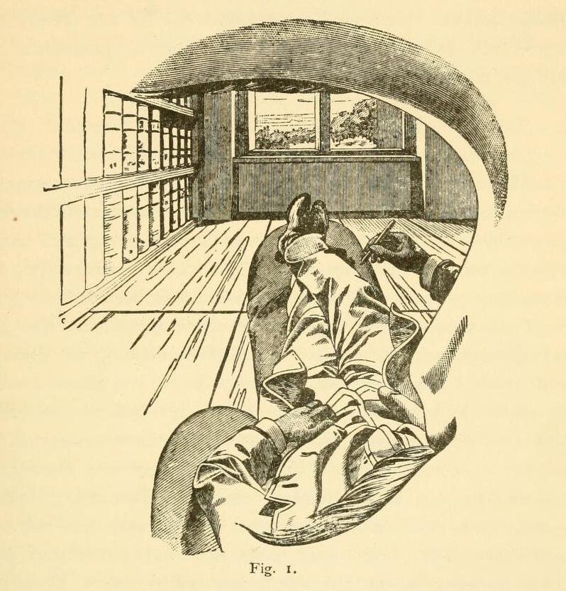
“On the other hand, if we take the visual field metaphor literally, as Ernst Mach did in his famous 1886 vignette of his act of seeing, we need not regard the blank paper as the content of a larger framed picture (the totality of the page), engaged in a figure-ground relation. The blank page, which in a printed book is not automatically a blank image in the modernist manner, becomes around the vignette an indifferent fictional environs, filled with type or blank paper, the indeterminate world out of which the image, understood as a mental representation of the physical world, emerges.”
Figure 5. Ernst Mach, “Figure 1,” engraved illustration to Beiträge zur Analyse der Empfindungen [Contributions to the Analysis of Sensation] (Jena: Gustav Fischer, 1886), p.14.
The purpose of Mach’s vignette — which combines ‘light’ and ‘dark’ modes to convey a sense of orbital arch and periphery — was to “carry out the self-perception ‘I,”’ perform the cogito, showing that it consists of ordinary sensation and nothing more, certainly not the intuition of a transcendental ego.24 It is almost as if noticing the vignette’s handiness for depicting consciousness led people to distrust it as penny-ante illusion. Like the vignette. After all, if being a subject is like devising and looking at the little clusters of grapes, why accord it any special value? Without throwing Manet and Mallarmé into a pot with the skeptical empiricist Mach, we can read the refined but restrained vignettes in the 1876 first edition of The Afternoon of a Faun (L’Après-Midi d’un faune) as a nostalgic farewell to the hallucinatory intensity of “The Raven.”25 There is a full-page, hand-colored frontispiece vignette of the faun, in lateral format so that once again we have to turn the book around to look at him. There is a playful headpiece of nude nymphs bathing in the reeds to kick off the theatrical plaint of the faun: “LE FAVNE / Ces nymphes, je les veux perpétuer. / Si clair. Leur incarnate léger … Aimais-je un rêve?”26 An erotic mock-epic follows, full of frustrated desire and verbal fireworks, before the intoxicated faun bids his (imaginary?) nymphs farewell and falls asleep. Manet’s final illustration (Figure 6) is a cursive, tossed-off cluster of grapes hanging on a vine, a literal sign of the faun’s state and a sexually suggestive soupçon on his closing words: “Couple, adieu; I will see the shadow you became.”27

“We have returned to the etymological birth of the vignette, the little vine, which might as well spell its death. The subtle inner world of Mallarmé, unlike Mach’s, cannot be communicated in a doodle, and certainly not without language.”
Figure 6. Édouard Manet, Tailpiece to Stéphane Mallarmé, L’Aprés-Midi d’un faune [The Afternoon of a Faun] (Paris: Alphonse Derenne, 1876), p.12.
The shadow, of the nymphs and their ordinary cause, the wine drunk by the faun, is bodied forth in the vine.28 We have returned to the etymological birth of the vignette, the little vine, which might as well spell its death. The subtle inner world of Mallarmé, unlike Mach’s, cannot be communicated in a doodle, and certainly not without language. It is primarily in the fragmentary, vignette-like verbal incantations of the desiring, dreaming faun that his subjectivity slumbers.29 This leaves the simple closing vignette in the air — perhaps a fitting place for it.
Popping the Bubble
The happy afterlife of the vignette, away from the front line of literary and artistic experiment, to say nothing of solemn doubts about the communicability of private experience, is borne out by the popularity of the cartoon thought bubble. Whether enclosed in simple ovals (preceded by little ovals tracing a path from a character’s head), sketched clouds of surmise, or left open in the manner of the old vignettes, the thought bubble is thought made transparent, even if only in substantival form: some food or object of desire, or else shorthand clichés like the brainstorm and the lightbulb, herald of good ideas. We may doubt such transparent thinkers have any inner world worth penetrating, or, in an art-historical vein, whether thought bubbles are genuine vignettes: they lack the isolation and casualness about their connection to the rest of the page.30 Profound or not, the vignette in thought-bubble guise need not be trivial in its aesthetic and psychological effect. A virtuoso like George Herriman manipulates the frame of a comic panel to convey both the standpoint of a character and the material conditions that have brought it there. In Krazy Kat for 29 August 1943, Ignaz Mouse foils Officer Pupp, who is surveilling him through a periscope, by blocking it with a flower pot (Figure 7). But the cop has the last laugh, because flower pots have holes in the bottom.

“We can both know “what it is like” to be someone and be wrong about it. As if to underscore the vignette’s simultaneous narrative and critical potential, the bottom of the comic, a kind of elongated gutter, depicts a periscope to whose visor is pressed not the eye of a viewer but a mere slip of paper with a drawing of an eye.”
Figure 7. George Herriman, Krazy Kat Sunday comic, 29 August 1943, detail, reproduced from Krazy Kat: A Celebration of Sundays, ed. Patrick McDonnell and Peter Maresca (Palo Alto: Sunday Press, 2010).
The final scene of the mouse in jail is seen through a round-cornered frame that blends into the night, transforming the newspaper page into a periscope. The vignette is here understood as the material effect of seeing through an optical device of surveillance, such as that used in the story — though the fact that we see that very device through a periscope-frame might lead to worries that someone else is watching all, including the authority figure Pupp.31 This narrative twist aside, the disruptive role of the vignette here has less to do with immersing or shaking us out of a temporary perch in the story, as did Andersen’s or Poe’s illustrators. Herriman’s full-page comic, with its jive-talking animals and flat planes of color and abstractly framed panels, draws us into and pulls us out of the narrative at every step. What the vignette does here is bring the push and pull of attentive reading and detached aesthetic observation to a standstill: it is as if the two are aligned in the lens of the periscope, which is both formal device and narrative gimmick. We can both know “what it is like” to be someone and be wrong about it. As if to underscore the vignette’s simultaneous narrative and critical potential, the bottom of the comic, a kind of elongated gutter, depicts a periscope to whose visor is pressed not the eye of a viewer but a mere slip of paper with a drawing of an eye. A vignette seen by another, en abyme, it reminds us that art need not be ponderous to be wise.32
❃ ❃ ❃
Andrei Pop is an Associate Professor in the Committee on Social Thought and the Department of Art History at the University of Chicago. He has published monographs on Antiquity, Theatre, and the Painting of Henry Fuseli (Oxford, 2015) and A Forest of Symbols: Art, Science, and Truth in the Long Nineteenth Century (Zone, 2019), and edited Ugliness: The Non-Beautiful in Art and Theory (2013) and Karl Rosenkranz’s Aesthetics of Ugliness (2015, both with Mechtild Widrich). He is interested in logic, subjectivity, and meaning in art and life.
Also by Andrei Pop
- The title of this essay is borrowed from the lyrics of the title song on Young Marble Giants’ Colossal Youth (Rough Trade Records, 1980). The song and album title is taken from a phrase by the art historian Gisela Richter concerning archaic kouroi which guarded the entrance to the Piraeus.
Edgar Allan Poe, “The Oval Portrait” in The Collected Works of Edgar Allan Poe, vol. 2: Tales and Sketches 1831-1842, ed. Thomas Ollive Mabbott (Cambridge, Mass.: Belknap Press, 1978), 664. The tale was initially printed in Graham’s Magazine (April 1842) as “Life in Death,” and reprinted with significant changes in The Broadway Journal (26 April 1845) under the familiar name “The Oval Portrait.”
↩
- Ibid. ↩
- Or his nephew Robert Matthew Sully, Poe’s friend. Poe’s biographer Mary Phillips was told by Robert’s granddaughter Julia Sully that Poe was inspired by “an oval portrait, two-thirds life-size, of a girl holding in her hand a locket that hung about her bare neck.” (Poe, Tales, 660). Its whereabouts are unknown, but what Poe says of his figure (head and shoulders only) excludes any strong parallel. ↩
- Poe, Tales, 664. The bracketed “yet fantastically” was cut in the 1845 reprint, and “in Moresque” added. ↩
- Poe, Tales, 666. In the 1842 version, there follows some inadvertent musing: “The painter then added — ‘But is this indeed Death?’” The phrase was struck along with the original Coleridgian title. ↩
- Poe, Tales, 667. This includes a dazzling philosophical discussion of relative quantities and a standard for their comparison, connected to the life and death question whether the dose of opium he intended to take was sufficient or constituted an overdose. Mabbott thinks the opening was cut because the story of the portrait was not supernatural enough to require the naturalistic alibi of an opium dream (such as Poe prominently provides in “The House of Usher”). ↩
- Poe, Tales, 662. ↩
- Linguistically, it is worth noting that the term is already in Antoine Furetière’s 1690 Dictionnaire universel (La Haye and Rotterdam: Arnout & Reinier Leers), III:619 (“printer’s term. It is a little wood or metal plate, generally engraved with vines or grapes, placed as ornament at the head of a page, at the beginning of a book. One has also engraved copperplates of divers designs, or of figures [chiffres].”). Probably due to its ‘frenchy-ness,’ it is absent from Johnson until the posthumous 1827 edition enlarged by Robert Jameson (“ornamental flowers or figures placed by printers at the beginning or end of chapters, sometimes emblematical of the subject” (772)). Readers were quicker: the 1798 edition of Josiah Relph’s Poems (Carlisle: J. Mitchell), “embellished with picturesque engravings on wood by Mr. T. Bewick, of Newcastle,” refers in a footnote to “the vignette in the title-page,” and by 1804, Longman et al. were advertising Robert Southey’s Madoc, to appear the following year, as “embellished with Four beautiful Vignettes.” Note the ambiguity between decoration and content (flowers or figures, with or without connection to the text). On the side of persistence, I will mention just the photographic vignette, whose origin the OED dates to the 1850: I have a vignette portrait photograph of my grandmother, and I just saw one of Cory Booker, c.1992, reprinted in the July 2020 issue of the Stanford alumni magazine (96). ↩
- Charles Rosen and Henri Zerner, “The Romantic Vignette and Thomas Bewick” in Romanticism and Realism: The Mythology of Nineteenth-Century Art (New York: Viking, 1984), 71-96, still the best introduction to the subject; see also the first chapter of the book, “The Fingerprint: A Vignette,” 1-6. ↩
- The Danish is earthier: “There is no such thin-skinned customer [ømskindet kunde] as a real princess.” Unless otherwise noted all translations are by the author. ↩
- In the manner of Paul de Man’s reading of “How can we tell the dancer from the dance?”, which he claims may be a question of Yeats’s addressed to us! See Paul de Man, “Semiology and Rhetoric,” in Diacritics Vol. 3, No. 3 (Fall 1973): 27-33 and William Butler Yeats’s poem “Among School Children.” ↩
- This convention is already established by the time of A General History of Quadrupeds (Newcastle: Hodgson, Beilby, and Bewick, 1790), whose entries routinely begin with one of Bewick’s wood engravings of an animal breed, with characteristic detail and a background, and conclude with a small generic decoration, e.g.,.
 For new directions in Bewick scholarship, paying close attention to his procedure, and the resulting “shuttling between the imaginary and the real” in the vignettes, see especially Esther Chadwick, “Bewick’s ‘Little Whimsies:’ Printmaking, Paper Money and Currency Radicalism in Early Nineteenth-Century Britain,” Art History, Vol.41, No.1 (February 2018), 42-71 (Quotation on p.65). ↩
- As you might know, and readers at mid-nineteenth century were more likely to, a dried pea is whitish and thus resembles a pearl even in color. I suspect the irregular sphere at lower right, just below the large gemstone: but I cannot believe Pedersen intended to make the ‘real’ pea obvious. ↩
- In his annotated translation, W. Glyn Jones, “‘Eventyr, fortalte for Børn’ (1835): ‘Prindsessen paa Ærten,’” in Essays in Annotated Translation, Norwich Papers, vol. 2, ed. Christopher Smith (1994), 115-24, following Leif Ludvig Albertsen, stresses the use of the predicates rigtig and virkelig, applied in sardonic fashion to princesses and stories, but alas he mixes up the two in English, turning rigtig into “real” and virkelig into “proper.” ↩
- Cf. Meyer Schapiro, “On Some Problems in the Semiotics of Visual Art: Field and Vehicle in Image-Signs,” Simiolus, Vol.6, No.1 (1972-1973), 1-19: “Mondrian constructed a grid of vertical and horizontal lines of unequal thickness, forming rectangles of which some are incomplete, being intercepted by the edge of the field… we seem to behold only a small part of an infinitely extended structure… the conception of the world as law-bound in the relation of simple, elementary components, yet open, unbounded and contingent as a whole.” (19) One might also recall Rosalind Krauss’s conception of “the cut” in photography, though its relation to the vignette is complicated. ↩
- One notable exception is Michèle Hannoosh, “From Nevermore to Eternity: Manet, Mallarmé and the Raven,” in Livres d’Artistes 1874–1999: The Dialogue Between Painting and Poetry, ed. Jean Khalfa (Cambridge: Black Apollo Press, 2000), 37-57, which does however emphasize the familiar anti-narrative modernist themes of “negation, nothingness, chance” (50). ↩
- See Andrei Pop, A Forest of Symbols: Art, Science, and Truth in the Long Nineteenth Century (New York: Zone, 2019), 51-84. The ineffable in the poem is of course partly visual, but it also concerns feelings and sensations (notably touch) only indirectly visible in the prints in features like furniture. ↩
- Poe, “The Philosophy of Composition,” Graham’s Magazine, Vol.28, No.3 (March 1846), 66. Poe also insisted that “circumscription of space,” such as one gets in “The Raven” and vignetting subtly abets, “has the force of the frame to a picture,” concentrating attention. I am grateful to a brilliant term paper by Yun Ha Kim on “The Modern Room,” in my Spring 2020 seminar on Modernism, for drawing to my attention this part of Poe’s theory. ↩
- This is the first narrative lithograph: there is a small open-winged raven on the ex libris, and a bust of the raven, which one might call a vignette, on the book’s imitation parchment slip-case. ↩
- A suggestion aired by Juliet Wilson-Bareau in Manet 1832-1883, eds. Françoise Cachin, Charles S. Moffett and Juliet Wilson-Bareau, Exh. Cat. (New York: Metropolitan Museum of Art, 1983), 382-3. ↩
- Here particularly Doré’s more literal version falls far short, showing, rather anticlimactically, the narrator’s body contorted on the floor so that the raven’s shadow may fall upon it. ↩
- Most commentators on the book noted it: Sarah Helen Whitman, Poe’s one-time fiancée, told Mallarmé she wished to burn it, Mallarmé himself admitted to not entirely liking it, and Richard Hengist Horne opined that it would look just as good upside down (which would place the raven’s shadow right side up). Dante Gabriel Rossetti fulminated that Manet was “the most conceited ass that ever lived” and that a copy should be in “every hypochondriacal ward in Lunatic Asylums,” but he did not specify which of the prints led him to say this. See Pop, 69, 259, 262. ↩
- On the modernist ‘default’ of perceiving a blank field pictorially, see Clement Greenberg, “After Abstract Expressionism,” [1962] in Collected Essays and Criticism: Modernism with a Vengeance, 1957-1969, Vol. 4, ed. John O’Brian (Chicago: University of Chicago Press, 1993), : “a stretched or tacked-up canvas already exists as a picture—though not necessarily a good one.” (131) Greenberg’s point is reasonable in light of the contextual cues to pictoriality embodied in stretching or tacking up canvas. ↩
- See Ernst Mach, Beiträge zur Analyse der Empfindungen [Contributions to the Analysis of Sensation] (Jena: Gustav Fischer, 1886), preface, and Pop, 148-79, for exegesis and criticism of this negative argument about the substantiveness of the self. ↩
- There may be several motives for this: Lesclide’s financial losses on the Corbeau, the difference between a bibliophile edition of a beloved classic and an experimental single-poem brochure by the respected but still relatively unknown Mallarmé, and much more. ↩
- Mallarmé, L’Après-Midi d’un faune (Paris: Derenne, 1876), 7 (really the first page of text): “These nymphs I want to perpetuate. / So bright / Their light blush … Did I love a dream?” ↩
- The couple is not the union of faun and nymph but a pair of disappearing nymphs: see Robert Greer Cohn, Toward the Poems of Mallarmé (Berkeley and Los Angeles: University of California Press, 1965), 25: “[the earlier phrase] mal d’être deux: implies the frustrated conjunction. They are not a true amorous couple but merely juxtaposed. There is a further allusion to a more general separation between any two realities short of total union in pure love, not present in this life.” If Cohn is right about this being the case earlier in the poem, the final “couple” ought to recall some of this pain. ↩
- Of course “real” fauns and nymphs enjoy wine; but the faun worries that the nymphs are figments of his deranged senses, in which case the grapes could stand for disenchanted reality. One wonders whether, in turn, the faun is really a faun in that case. ↩
- As Jessie Alperin pointed out to me, Mallarmé since his first efforts to publish the “Faun” wanted the text set in generous blank space: “I would like quite a tight typeface, suitable for the condensation of the poem, but with air between the lines, space, so that they can be separated from each other, which is necessary even with their condensation.” See Stéphane Mallarmé to Catulle Mendès, 24 April, 1866 in Correspondance: Lettres sur la Poésie, 294. Cf. Brigitte Ouvry-Vial, “Stéphane Mallarmé Self-Appointed Publisher of His Own Work: 1865-98, the Editorial Epic of The Afternoon of a Faun,” Quaerendo, Vol.44, No.1-2 (2014), 1-36. ↩
- Should my tone leave it unclear, let me assure the reader that I believe in the interiority of Chip and Dale, and other users of thought bubbles, as much as I do in the faun’s or Hamlet’s! Nor will the formal quibble convince any reader of Réne Goscinny and Jean-Jacques Sempé’s Petit Nicolas: when Nicolas pictures his marriage to Louise amidst the detritus of the playground, or the unhappy boys envision the variform walloping they will get when their parents see their report cards, the effect of soaring imagination, or painful apprehension, is in no way impeded by the mechanics of thought bubbles. There are even classic vignettes emerging ex negativo from inky darkness in Nicolas’s nightmare about being caught by the principal. ↩
- The pertinence of this and other comics to the critique of a “scopic regime” sketched in Jonathan Crary, Techniques of the Observer (Cambridge, Mass.: MIT Press, 1990) especially for the nineteenth century cannot be overemphasized; but their playful subversion suggests there is more to the story of surveillance than the glum Foucauldian metaphor of the panopticon in which we live. Periscopes are frequent in Krazy Kat, for instance on 12 December 1937 (where the optical device turns out to be an old gas pipe planted in the water by Ignaz) and 5 December 1942, where they are connected to the threat of Axis submarines (but still wielded by Ignaz). My thanks to Peter Maresca for permission to reproduce the 29 August 1943 Sunday page from Sunday Press’s lovely edition. ↩
- I may be pushing the sense of en abyme, since there is no regress: but the implication is that our eye might be of the same kind, in turn seen by another, etc. ↩
Suggested Reading

Machado’s Counselor of the Air
Kenneth David Jackson

Strange Times and Weird Atmosphere
Marco Caracciolo

Air Bubbles Musical Environment
Haast - Hawea